Positioning Guide


The positioning section describes the graphs you can create to help you position properties. When you "Position" properties, you compare the subject property to the competition through buyer's eyes.

In most cases, when using the Positioning function, you will want to do a new search. This search would be different than that original search used to find the neighborhood patterns and Pricing. Buyer's eyes should drive this search. Generally, buyers will be price sensitive. In this search, you would expand your area and focus on the price range. The thinking is that if a buyer were to look at the subject property, that buyer might also look outside the immediate area focusing on a price range.

I want to see how to do my positioning search.

To load your "Positioning" data, select the Upload Positioning Data button. After reading in your "Positioning" data, the program will automatically create a "Positioning" Scattergram where all the properties that are currently on the market (properties For Sale or Under Contract) will be placed on the graph. When you are at the "Positioning" area, you will notice three key changes on the screen, described in more detail below.

Several "Pricing" area functions are duplicated in the "Positioning" area. In describing the "Positioning" area, we assume that you already have reviewed the Pricing area and will reference that discussion. Most of the key overlapping functionality has to do with the creation of Scattergrams.

Scattergrams are a great "comparison" tool. Scattergrams make it easier to compare properties based on five key factors. Those five key factors are: property location, property price, property size, and the unique features and the condition of the properties. You can summarize all five of those factors on one Scattergram at one time. The features of a Scattergram make it a great pricing tool and allow it to be a great "comparison" tool in general. Thus, you will find that in the positioning function, Scattergrams will be a handy tool to compare the subject property to the competition.

Since Scattergrams are as useful in Positioning the subject property as in the Pricing function, this determines the overlapping functions between the Pricing and Positioning functions. Here is a list of the key overlapping functions that both Positioning and Pricing have.


You will see the Active Data sheet when you go to the Positioning area. The Active Data Sheet is comparable to the MLS Data sheet you find in the Pricing area. The key difference is that since this Positioning search is from a Buyer's perspective, you will only find properties that are currently For Sale or Under Contract. (The MLS Data sheet, includes all status activities.)

If you've just read in data using the Upload Positioning Data button, then the program will automatically create a "Positioning" graph for you. File folders at the bottom of the screen labeled "PosGram" identify the Positioning graph. All properties located in the Active Data sheet are on the Positioning graph.


The Positioning Scattergram

The Positioning Scattergram is similar to the Pricing Scattergram but differs in one key aspect. The Positioning Scattergram only includes properties For Sale. The Pricing Scattergram can include properties with ALL statuses'. Since the Positioning Scattegram doesn't include Sold properties, it also doesn't include the "Fair Market Value Line".


Another difference you will notice with the Positioning Scattergram is that there is less correlation between price and size as compared to the Pricing Scattergram. There are primarily two reasons for this difference. The first is that these are For Sale and not actual Sold prices. So this somewhat reflects a "wish" list of prices. Of course, with any Scattergram, you must consider special features and conditions. The second reason you will find more dispersion on a Positioning Scattergram is that the data area is much larger, allowing the location to play a more significant role in the price. When you compare properties on the Positioning Scattergram, you also need to take special note of the location.

One of the differences between the "Pricing" area and the "Positioning" area is that in the MLS Data Form only a set of the recently sold properties sold are selected by default. Whereas, in the Active Data sheet all properties are selected by default. If you are using the Upload Positioning feature, properties For Sale and Under Contract are selected and placed on the "Positioning" Scattergram. You need to be aware of all the properties For Sale to see if they are competition for the subject property.


The Subject Property


If you have not yet reviewed the section on the concept of the Subject Property located in the "Pricing" area, we recommend that you do that first. This section will really focus on how the Subject Property is handled in the "Positioning" area.

As in the "Pricing" area, the Subject property allows you to either add a property and declare it as a "Subject" property or change the "status" of an existing property to "Subject". The Subject property allows you to analyze a newly added or existing property For Sale. When you identify a property as "Subject", just like in the "Pricing" area, that property is placed on the graph in a larger red circle.


The "Subject" property must have both the "size" of the property and the "List Price" greater than 0 to be placed on the graph. This is different than the use of the "Subject" property in the "Pricing" area. If the property you identify as "Subject" is not on the graph check the "size" and the "price" values. Also, make sure that the status is "Subject" (with a capital "S").


Positioning Quadrants


Another key concept is the usage of the "Positioning Quadrants". The "Positioning Quadrants" can be a helpful tool in comparing the subject property to the competition. Let's show you how to create the "Positioning Quadrants". Then we'll discuss using this concept to compare the subject property to the competition. To create your Positioning Quadrants, you must first identify a "Subject" property, and that property needs to be "selected". Then when you create your graph (using Graph Options -> Create Graph ), select the Show Positioning Quadrant option.


The graph is divided into four areas when you create your Positioning Scattergram. The point of the "Subject" property is at the center of the boxes.


Properties can be in one of four quadrant areas.

By comparing your property to the competition, you can decide as to where "in-line" you are (or will be). This comparison combined with the pond can be an effective tool in helping you position the subject property to sell in your market.


The Real Estate Pond


The section decribes the Real Estate Pond. The Real Estate Pond is an analogy between a pond or lake and Real Estate. Just like water can flow in and out of the pond, homes come on and off the market in the Real Estate Pond. In a pond or lake of water, you have inflow activity, outflow activity, and the current water depth. If you have more inflow than outflow, the pond's water level increases. If you have more outflow that inflow, the pond's water level decreases. This model follow the Real Estate pond. In a Real Estate Pond, you have an inflow of new homes coming on the market, an outflow of sold properties going off the market, and a current supply of homes for sale.

In a body of water, there can be "levels". The deeper you go, the colder and darker the water gets, and there is less movement. Levels exist in the Real Estate Market as in the Real Estate Pond.

In the Real Estate pond, the best homes that are priced right and show great float along the top and go under contract promptly. They then close and flow out of the Real Estate pond. All of this happens in a period shown by the Time to Sell chart. Homes that don't show so great or are overpriced, will sit at the top and eventually start to sink. Eventually, they will sink to the bottom of the pond and become part of the stagnant mass. Once they are part of the stagnant mass, they will result in either withdrawn or expired listings. Sometimes they will be picked up by bottom feeders. These are buyers who are looking for a "deal". They wait for properties that sit on the market for an extended period and submit "low" offers to see if they can pick them up at a bargain.

When looking at a pond, you will want to see the difference between the projected inflow and outflow to see if the supply is increasing or decreasing.

The Real Estate Pond makes a projection on what may happen in the next three months. This projection is based on the current sale rate and filtered by the buying pattern. The projected pond takes into consideration the market trend and the seasonality of the market.

For the projected pond to work accurately, be sure to include ALL status activities for the last two years. This data collection will provide enough data for the program to do effective trend analysis for both sold and new homes coming on the market.

I want to see how the Real Estate Pond works.

One of the key benefits of the pond is that it projects how many sales will occur in the next three months. It then considers the current inventory, its time on the market, and the properties currently Under Contract. It then determines the projected number of new sales that will occur. This projection will give you a great idea of how "competitive" the market is for this specific situation. Having a good idea of the number of properties projected to sell in the next three months will give you an idea of how aggressive (or conservative) you need to be when you "position" a property.

This projection, with the projected new upcoming listings, the pond determines if the current market situation favors the Buyer or the Seller. The "Supply and Demand" gauge at the top of the pond gives the user a quick idea of who the current market favors.

In this example, we can see five homes currently in the "Flowing" level. These are homes that are currently Under Contract. There are thirteen homes in the "Showing" level. These are homes that are For Sale. Lastly, two homes are showing in the "Stagnant" level. These homes are For Sale and have been on the market for a significant amount of time. That time is determined by the average "Time to Sell" of the data provided. Once a home exceeds that average and is not yet Under Contract, the probability of that property becoming a Withdrawn or Expired listing increases dramatically. These are homes that are "stuck in the mud".

In this example, six homes projected to sell in the next 90 days. With five homes Under Contract being part of the six to close, it leaves one new sale to occur in the next 90 days. Thirteen homes currently in the "Showing" level will make for a challenging sale. Only one of these properties will sell. In addition, there is a projection for another five homes to come on the market. We don't know when they will enter the market, but they are coming. For a property to sell in this market, it needs to be the "Best" value.


The Value Positioning Worksheet


The Value Positioning Sheet is a tool to use with sellers to help determine where they need to be “positioned” compared to other homes on the market. Here is an example of using the Value Positioning Sheet in the Focus 1st Pricing System. Follow along with the above sheet as we walk you through this example. The first lines are for your customer information.

Step #1: Pretend you are sitting with a buyer and about to select homes to look at. You will load the buyer’s search criteria into the MLS system. Where would this property show up in a search? What categories or criteria would a buyer use for this type of property? What other properties (similar to this) would a buyer would want to see? 
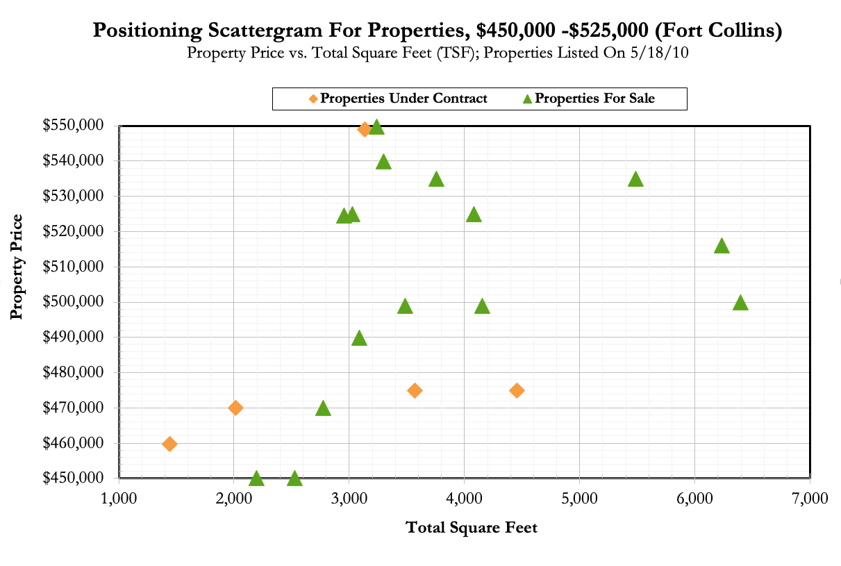
Buyers tend to search based on three general criteria: Style, Location, and Price Range. Once you have determined your search criteria, export your results into the Focus 1st Pricing System.

In looking at the competition through "buyers" eyes, you may determine to do a different search than you would when pricing a home. When pricing the property, the location is the most important factor. When positioning your home, in most cases, the buyer is focused on a price range. In most cases, when you search from the viewpoint of buyers eyes, you would be focused on properties in a price range in a larger area or location.

Once you've exported your data and read it into the Visual Pricing System, go to the “Positioning“ tab and select the Value Positioning Sheet” tab. It is filled out based on your search results.

Step #2: In this example, in the last 12 months, 21 properties have been sold. This data is just filled in based on the exported data that you provided.

Step #3: the number of homes sold (21) is divided by the length of time (12 months) to calculate the number of homes sold over the period, or 21 / 12 (which is 1.75 or rounded off to 1.8 properties per month). This calculation is the absorption rate.

Step #4: In this example, there are currently 15 homes for sale that match the criteria. When we add your seller's house to the homes that are available on the market, we increase that total number to 16 homes.

Step #5: Assuming that the market continues to sell homes at the rate of 1.8 per month (the absorption rate), how long will it take to sell the number of homes currently for sale (16 / 1.75 = 9.1). This calculation s the month's supply. Step #6: With the number of homes selling at 1.8 (1.75) per month, and with there being 16 properties for sale, the odds of your seller's homes selling within the next 30 days would be 1.8 / 16 = 11%.

This analysis assumes that there is a uniform rate of sales over the year (in other words, it s based on the idea that each month there are 1.8 sales). 
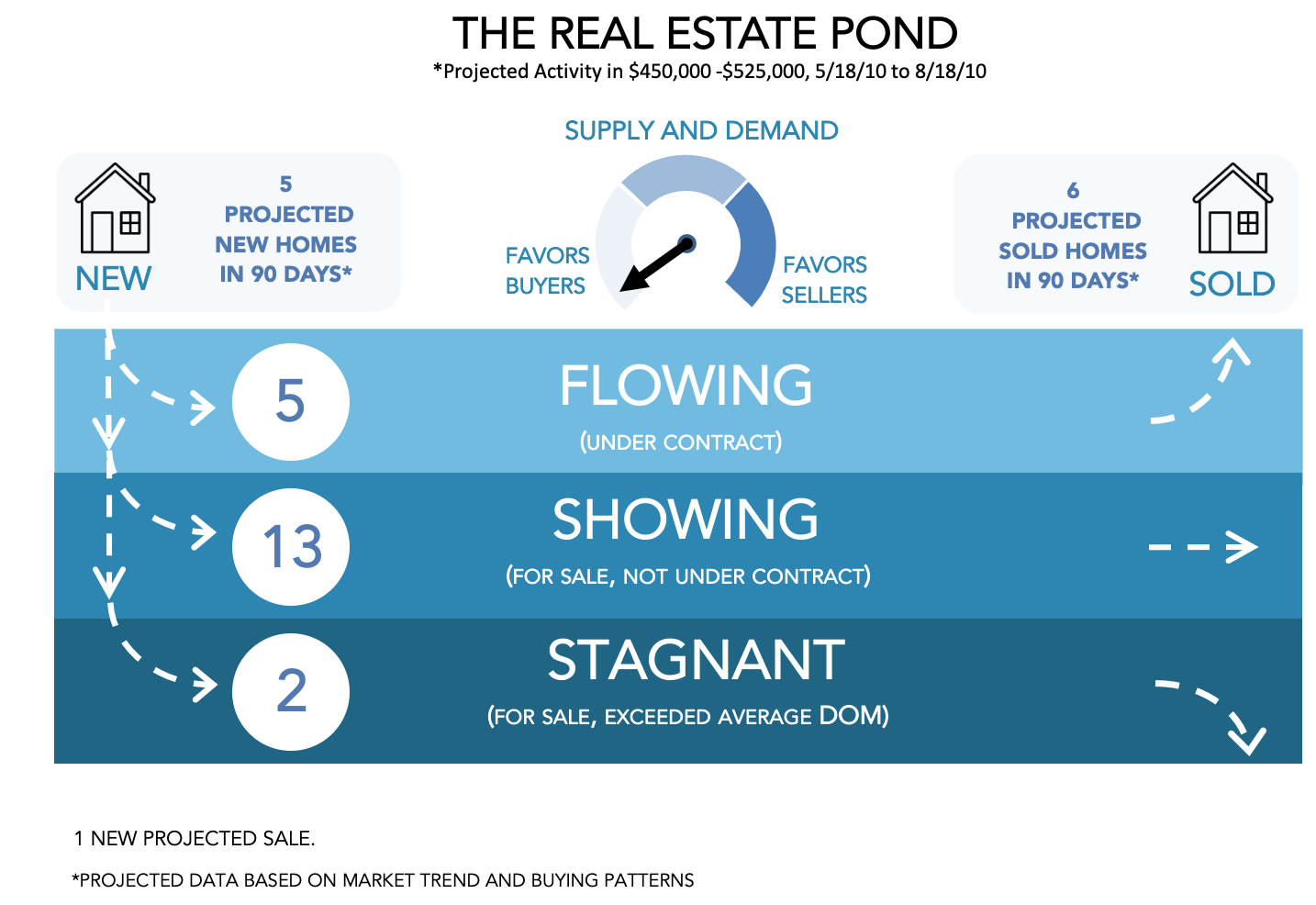
If you have a very seasonal market, we suggest you use the Projected Pond to estimate the number of sales in the upcoming months.

The seller may be concerned with their odds of selling in the next 30 days, being only 11% (not very high). However, they should be impressed that you can show them their odds with this level of precision. At this stage, you should make two key points:


Step #7: 
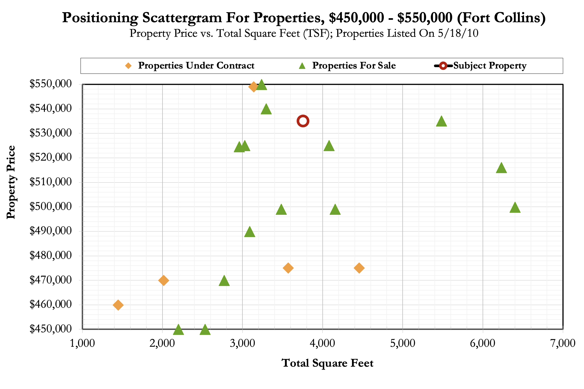
Use your expertise with MLS photos, descriptions, and Google maps, to select the top five houses (out of the 16) that a buyer will want to see first. Again, project yourself into the role of working with a buyer to pick the best of the 16 houses. Add the seller's house to the five, for a total of six houses to compare.

Next you will want to personally visit (or thoroughly evaluate via photos, mls data sheets, etc.) competing properties. Buyer's will be doing this, and you want to position your seller's house for the market using “Buyer Eyes”. You may want to consider taking the seller on the tour of the competition.

As you tour the competition, rate the seller's house on a one to six scales, with one being first place and six being last place. You might rate the seller's house as a “3” on condition but with some reconditioning and staging, you could get it to a “2”, which means it would be in second place on condition. Generally, a seller could improve condition and price, but not location. With time and money, someone may improve the features and amenities and perhaps even the size. Again buyers purchase on value, which is their perception of the relationship between these five factors.

For the very analytics out there, there is NO result where you add values to come up with the answer. Going through the analysis, you determine the seller's house positioning. While going through this exercise and rating the homes, as we discussed is helpful, we believe that the best way to compare properties is to use the Positioning Scattergram tool.
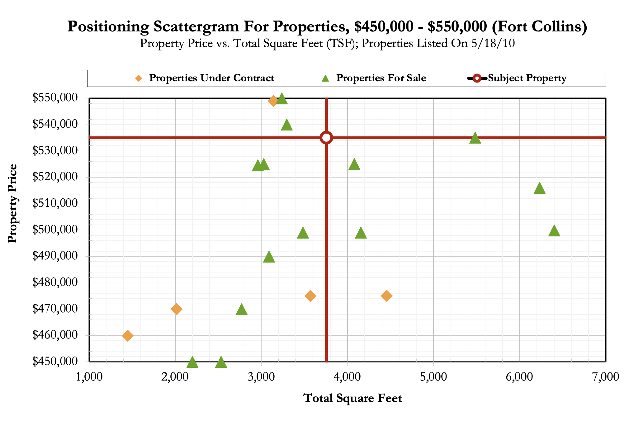
Step #8: If the seller wants to be under contract within 30 days, they need to position their house as the top 1 that a buyer would pick. If they do this, only one house will sell this month, and they should be that one. If they are in the top 3, and 1-2 (1.8 per month) are selling this month; they have a 50% odds of selling, etc.

Remember, markets are very dynamic. Tracking showings and buyer/Realtor comments is recommended. We also recommend you re-do your value positioning and absorption rate analysis every two to four weeks.

The above analysis is based on 12 months of data. If you have a seasonal market or market conditions are changing, it would be best to do this same analysis using the last three months as a “snapshot” of current market conditions. You may discover that the market has slowed (perhaps you need to be in the Top 1 to be under contract in 30 days) or the market has sped up (and you need to be in the Top 3 to be under contract in 30 days). The Focus 1st Pricing System does have a configuration parameter to change the Absorption Rate Period (default is 12 months).

If you have attended a Ninja Installation, you may recall that it is recommended that you determine the Absorption Rate for 3, 6, and 12-month intervals to determine if the market trend is increasing or declining. There is a configuration parameter which will calculate the Absorption Rate for those three periods for you.


For more instructions on how to run the Focus 1st software, be sure to check out our YouTube channel by selecting this link: