Patterns Guide


The patterns section describes several graphs automatically created after reading the initial export file (using the "Start Here" button).

In most cases, create your initial search based on location. In that case, the graphs and charts created in this section are a summary of the Real Estate activity in the search area.

I want to hear an explanation of the graphs in the Pattern.

When you first select the Patterns button, you will see the "Odds of Selling" graph. Additionally, below the graph, you will see several tabs, similar to that shown below. The actual number of tabs may differ, based on the data you provided and the options.


Change the graph by selecting the various tabs. Below are the sections pointing to the various tabs and their graphs.


Odds of Selling


Below is an example of the Odds of Selling graph.


The Odds of Selling is a great graph to give you a quick over of how real estate is doing in the specific area that was searched. The title of the graph is provided based on the "subdivision" and "city" (or what you have provided) that is there when reading in the export file. There are three main bars on the graph. Each bar summarizes the activity in one-year chunks. The bottom two bars summarize the activity in the last two years, while the top bar summarizes the activity in the last 12 months. When you are analyzing data, it is possible that the bar in the middle may not be a full year. A message stating, "This may not be a full year of data," will be shown if this is the case.

You do have the ability to configure which last two years of data you want to show. In other words, one of the last two years you are showing could include this year. To make adjustments to which of the last two years you want to show, you can use the Change Over Month parameter found in the Settings area.

The default graph shown is the last two years, as described above. However, you can also configure your results to show the Odds of Selling for the last 3, 6, and 12 months instead of the last two years.

The date the user collected the data is printed at the bottom of the graph. In this example, the user collected data on 1/27/23.

The information provided in each bar is the same and shown for the period stated. Here is a closer look at a bar and its information.


Each graph shows data in three key areas: Properties that have Sold (Closed), Properties that are still For Sale, and Properties that Did Not Sell. Properties that Did Not Sell are properties that were withdrawn or expired. These are properties that did not sell in this market for the value they have and their price. Everything listed in this period had to fall into one of these three categories.

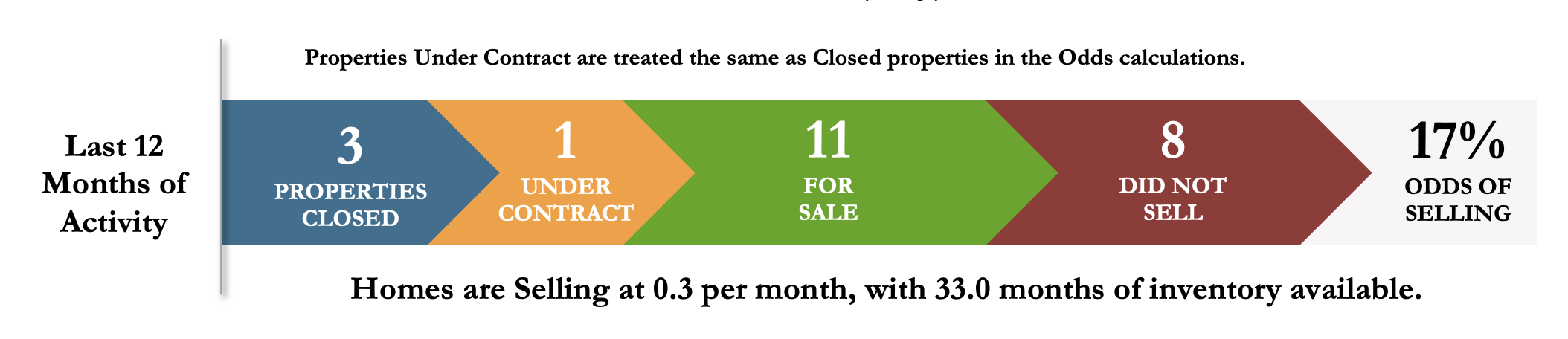
The "Last 12 months" (top) graph also shows the properties under contract.

The calculation of the Odds of Selling is the total number of homes that closed in that period divided by the number of properties listed in that same period (the number of properties that closed, the number of properties For Sale, the number of properties that did not sell, and the number of properties under contract).

The default for the "Last 12 Months" graph is to treat the properties under contract as closed properties. You can change how properties under contract are treated.

Under the bar are a couple of calculations that may be interesting from a real estate perspective. The first is the "Absorption Rate". The absorption rate is the average number of homes sold in a period. This calculation calculates the average number of homes sold per month. The following calculation is the "Months Supply". This calculation is the number of homes currently For Sale, divided by the absorption rate. The Months Supply is the length of time (number of months), it would take to exhaust the current inventory assuming the current rate of sales (and assuming no new inventory).

Several configuration changes can be made in the settings area that can affect the results on the "Odds of Selling" graph. Here are a few of the changes.


Time to Sell


Below is an example of the "Time to Sell" graph.


You can find the "Time to Sell" graph by selecting the appropriate tab at the bottom of the screen.


The tabs that show the "Time to Sell" graph have the "T2S" character appended to a number. The number is the "Year" for the data of the respective time to sell, and the "T2S" is an abbreviation for "Time to Sell".

The "Time to Sell" graph shows all the properties sold during the respective period, their sold price, and the days it took to close. The days it took to close is the "Close Date" minus the "List Date".

Included are the average days before closing and the average close price. The title of the graph consists of the "subdivision" and "city" (or what you have provided) when reading in the export file. The date the user collected the data is displayed at the bottom of the graph.

Several configuration changes can be made in the settings area that can affect the "Time to Sell" graph results. Here are a few of the changes.

  • The Change Over Month configuration parameter, could impact the year(s) shown. The same last two years on the "Odds of Selling" graph, are also displayed here in the "Time to Sell" area.
  • The Duplicate Listing Interval configuration parameter, is used to combine multiple MLS listings when a property is withdrawn (or expired) from the MLS and then added back, in a short interval (as defined by the value in the Duplicate Listing Interval). When the two (or more) MLS listings are combined, the "Days before Closed" will be the addition of the "Days on Market" on both MLS listings and the interval between them. This new result will be the data shown on the updated "Time to Sell" graph.
  • The Show 3,6, and 12 Months Odds of Selling configuration parameter will impact the "Time to Sell" graph period. While the default is to show a full year, when this option is set, the "Time to Sell" graph will show data for a "running" year.
  • The Show 'Median' instead of 'Average' on Time to Sell configuration parameter will change the "Average Days to Close" and the "Average Closed Price " to the "Mean Days to Close" and the "Mean Closed Price".
  • The Use DOM from MLS instead of calculating configuration parameter will change the source of "Days before Close" from the calculation to the data provided by the MLS.
  • The Use 'Under Contract Date' instead of 'Close Date' configuration parameter will change the data shown from "Days to Close" to "Days to Under Contract". (This assumes that the appropriate data from the MLS is provided.)
  • The Color Theme configuration parameter will change the color of the data points.


Buying Pattern


Here is an example of the "Buying Pattern" graph.


You can find the "Buying Pattern" graph by selecting the appropriate tab at the bottom of the screen.


The tabs that show the "Buying Pattern" graph have the "BP" character appended to a number. The number is the "Year" for the data of the respective time to sell, and the "BP" is an abbreviation for "Buying Pattern".

The "Buying Pattern" graph shows all the properties that sold during the respective period, and the number of properties that sold each month. The Buying Pattern may give you an idea if there is any correlation for when homes sell, and the time of the year (seasonality). The darker color shows if there is a specific pattern. More homes sold during this time of the year (as shown by the darker color).

The title of the graph is provided based on the "subdivision" and "city" (or what you have provided) that is there when reading in the export file. The date the user collected the data is displayed at the bottom of the graph.

Several configuration changes can be made in the settings area that can affect results of the "Buying Pattern" graph. Here are a few of the changes.

  • The Show 3,6, and 12 Months Odds of Selling configuration parameter will impact the "Time to Sell" graph period. The default is to show a full calendar year. Set this option to show the "running year" in the "Buying Pattern" graph.
  • The Color Theme configuration parameter will change the color of the data points.


Mulit-Year Buying Pattern


Below is an example of the "Multi-Year Buying Pattern" graph.


You can find the "Multi-Year Buying Pattern" graph by selecting the appropriate tab at the bottom of the screen.


The tab labeled "Multi-Year Buying Pattern" shows the graph. The "Multi-Year Buying Pattern" is only shown when then Multi-Year Buying Patterns configuration parameter is set in the Settings area. Usually, when setting this parameter, you will want to see how the sold price of homes in an area changes over a time. Thus, this makes for a great neighborhood "Appreciation" graph.


Search over several years of data to obtain the best results. To do an appreciation graph, you may want to consider only including Sold (or Closed) data to shorten the size of your export file. Of course, several other graphs won't have accurate data if you do this.

This feature works great for condos or other projects where the square footage of the properties are comparable. When using this feature to determine neighborhood appreciation (this is an excellent tool for that), we recommend limiting your search for property sizes to plus or minus 10%. For example, if the subject neighborhood median size (or property size) is 2200 square feet, then use a search where you look for all properties sold in the neighborhood over the last ten years and which have square footage between 1800 and 2400 (or so).


For more instructions on how to run the Focus 1st software, be sure to check out our YouTube channel by selecting this link: